Component Design · Case Study
Card component case study
Card component specifications, built from scratch with alignment from product designers and engineers.
Where design started
Cards display content and actions about a single subject.
- Use cards to contain related elements.
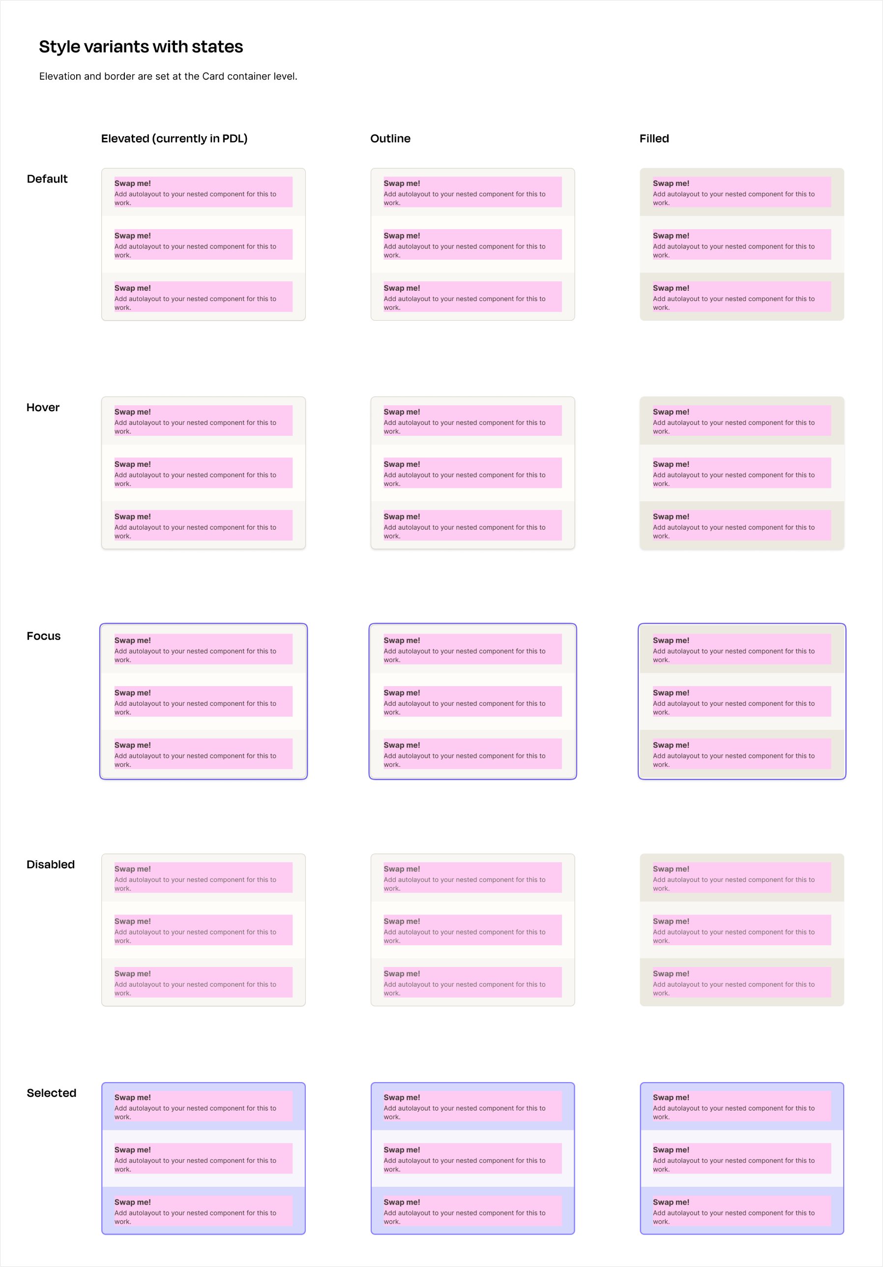
- Three styles: elevated, filled, outlined.
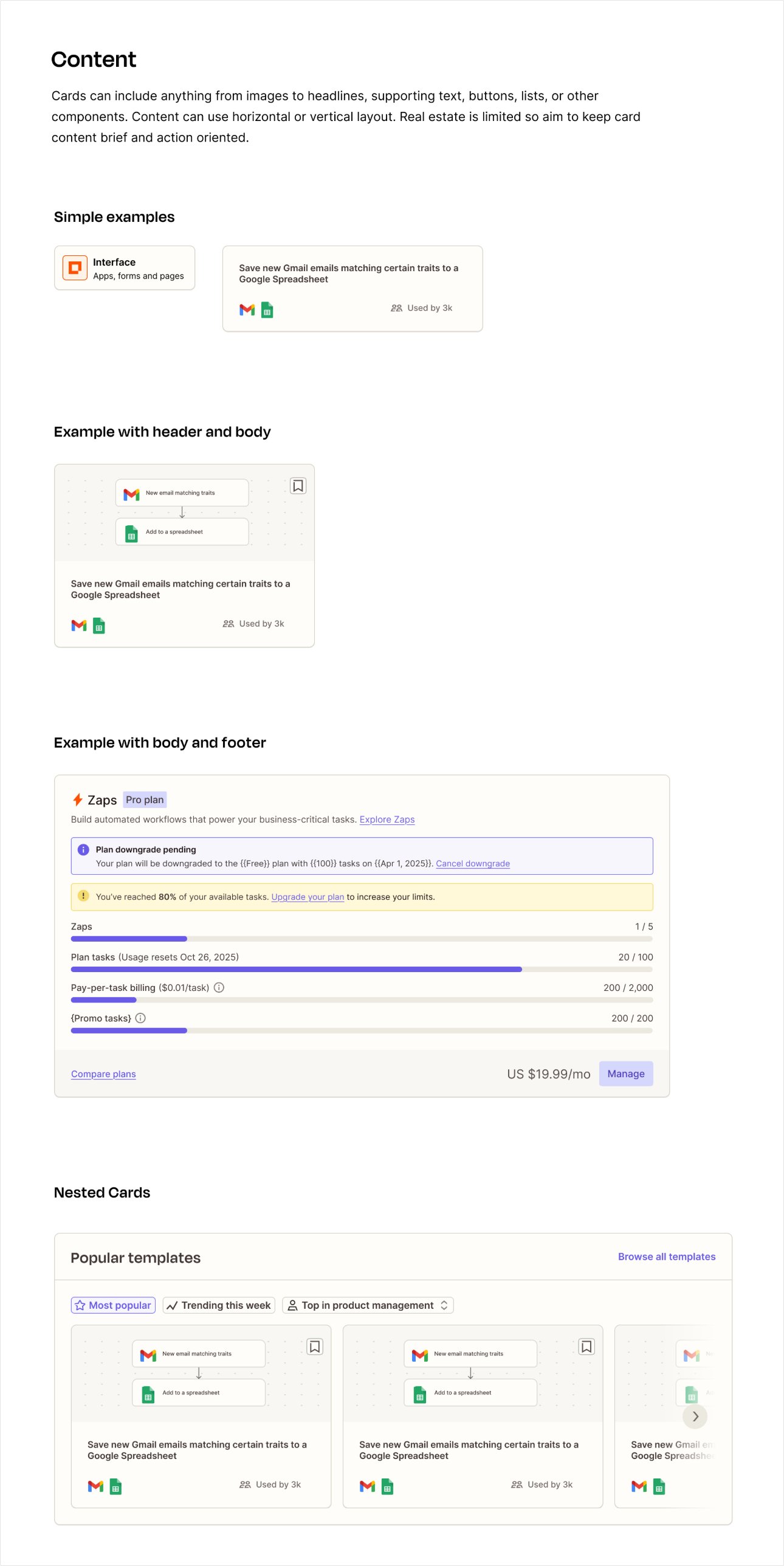
- Content can include anything from images to headlines, supporting text, buttons, lists, or other components.
- Cards have flexible layouts and dimensions based on their content.
I was looking to replace the following components with a more flexible Card component:
- Zap Card
- Zap Span Card
- Zap Mega Card
- Surface
Specifications
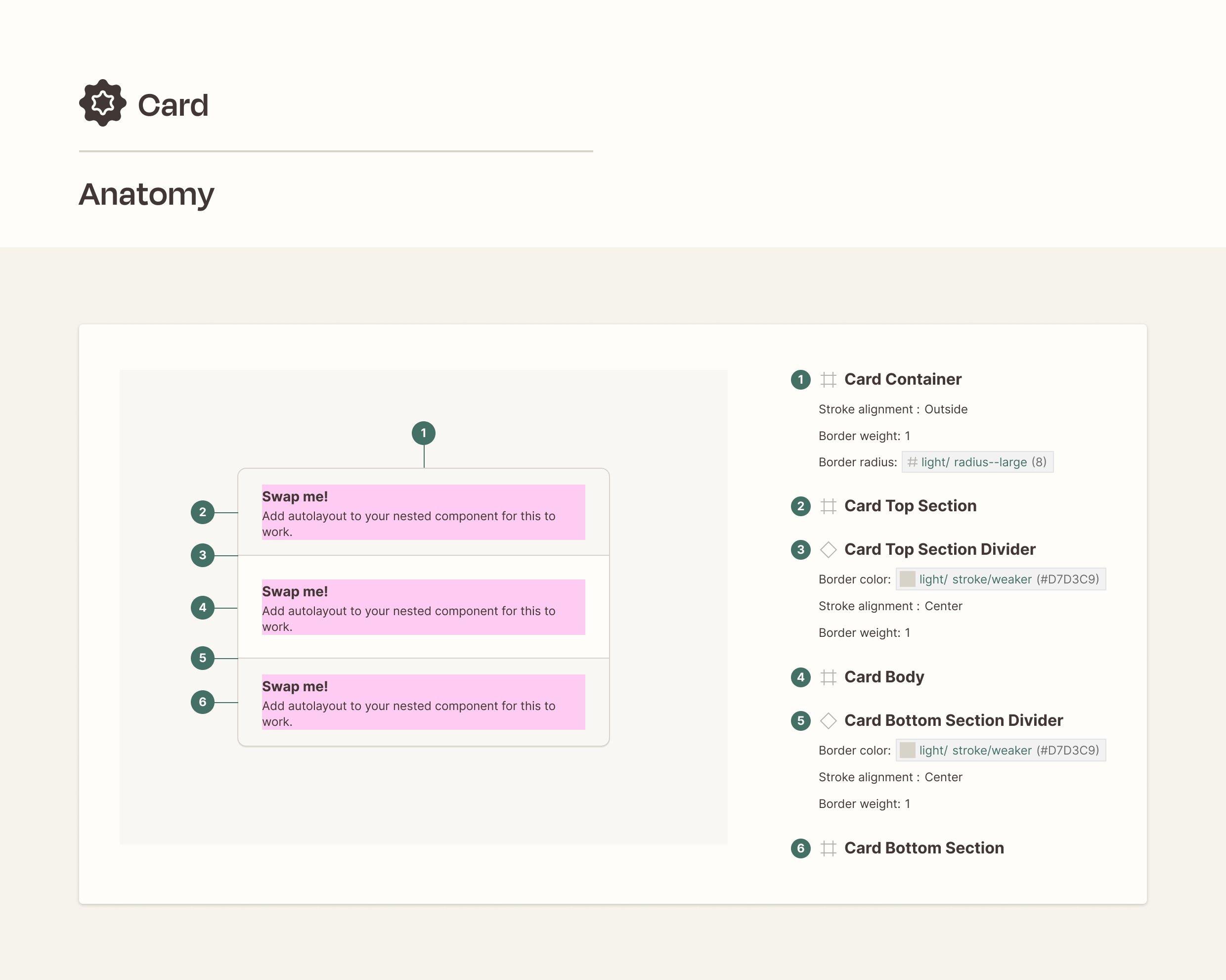
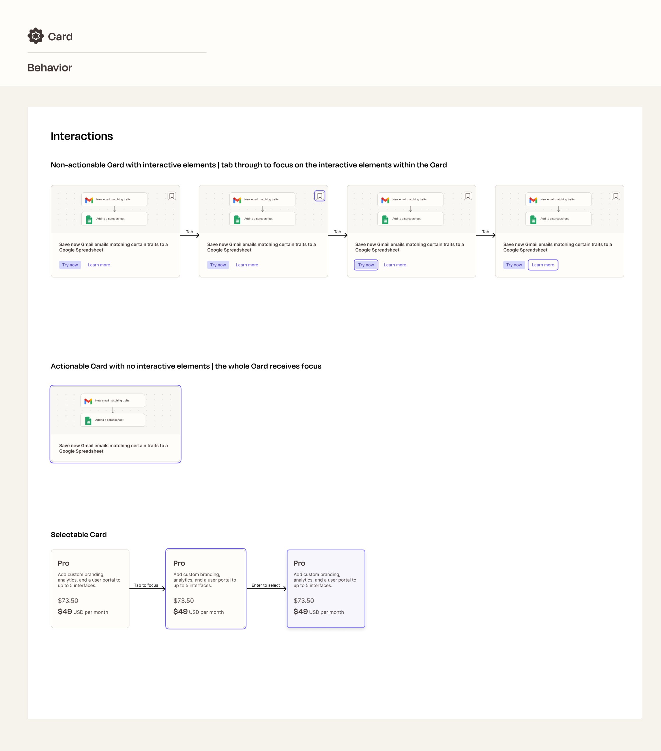
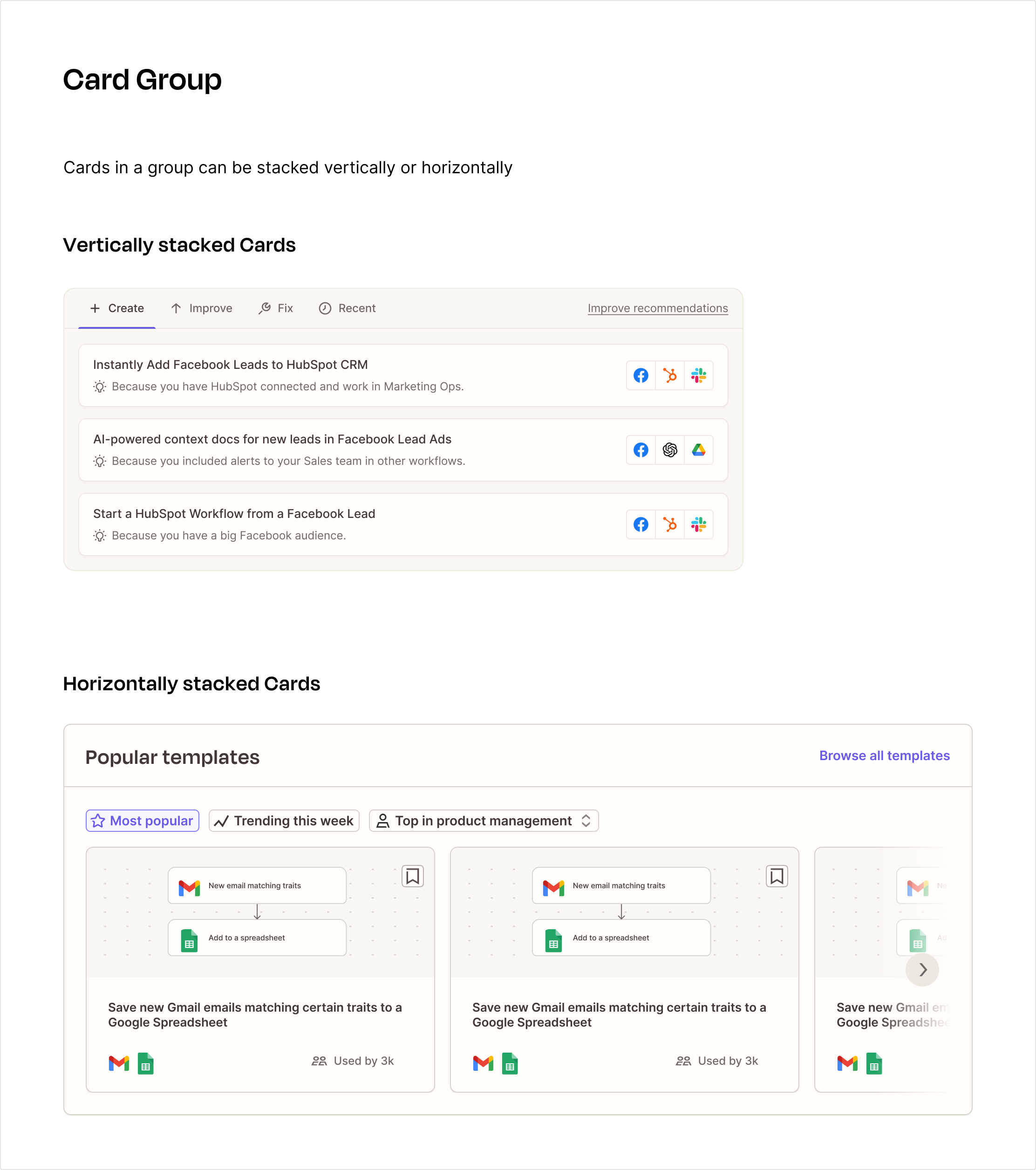
Specifications are final before Engineering starts writing code. Below are select samples, and more images are available.
Explorations
Explorations are unpolished and meant for feedback. Below are select samples, and more images are available.
More detailed images and a Figma component are available. I'd be glad to walk through the process.